Wednesday 30 June 2010

SP500 + EURUSD

Yesterday's strong sell-off took US equities down to the support lines for late May early June. Of the major US indices only the S&P500 managed to make a slight new low for the year, most other indices just managed to hold their lows (for now), including the Dow Industrials & Transports, the NYSE composite, Russell 2000, and the Nasdaq. In Europe the FTSE 100 managed to hold the lows by a whisker, whereas most other Euro markets are well above their lows from the height of the Euro Sovereign Debt crisis. With regard to US equities, we are right on the pivotal point, for the third time in the past 5 weeks. A good friend of mine use to say rather crudely about key pivotal market levels, that price action has to 'Lubricate to Penetrate'. I believe that describes what has been occurring these past few weeks, with next week or so likely to determine whether penetration does actually occur. One slight note of caution however for the bears (of which I am one at the moment); quarter end is upon us, the key payroll data is due,as are ISMs etc, plus the extended 4th July weekend break. Add the fact that this comes on top of an already hefty 8% decline in the past 7 days, and it would not surprise me if the market take a breather allowing for some consolidation, if not from here, then perhaps from slightly lower levels.

With regard to the EURUSD I have
talked to a few people who are frustrated with the failure of EURUSD to decline alongside US share indices this past week. This leads me to question whether the correlation between the two is breaking down. Below is a set of charts showing the SP500 over the past 5 years together with the EURUSD , and below them a chart of the 60 day correlation during that time. My reading of this (and I am no stato, so it is really a rather amateur reading), is that the correlation is generally rather poor, veering between periods of high correlation and low correlation but with no real consistency.
Further to this I have looked at the 60 Week correlation going back to 1990. And this shows an even less consistent relationship, and if anything the periods of high correlation have tended to occur at times of Equity and EURUSD strength.
So with no real evidence of a link between US equity index performance and the EURUSD historically, why the obsession with looking for weaker EURUSD when US equities moving lower? I have a view as to why this might be, it may be right or it may be utter nonsense, but here goes anyway: The 2008 sell-off in Equities and EURUSD was a complete flight from all risk, and since both Long Equities and Long EURUSD were long-held risk trades at the time, their correlated move was not surprising. The recent move lower in stocks at the end of April, was in part triggered by fears of a full-blown Euro Sovereign Debt crisis, this itself was causing a flight from the EURUSD.

However over the past couple of weeks, I believe it is has been different. The weakness in equity markets is probably due to fears of poor US economic prospects (Double dip recession), not as a result of a Bank/HF deleveraging and consequential risk flight, nor as a result of a heightening of the
Euro Sovereign Debt crisis. Therefore since the reason for this move would be a re-evaluation of US economic prospects, that should not be supportive for the USD going forward. On the other hand EURO economic prospects have already been massively downgraded as a result of the Euro Sovereign Debt crisis. -- Also, since an equity sell-off is leading to flight from risk (though not on the scale of 2008) it could be argued that this may actually be supportive for the EURUSD, since in 2007/8 risk was long EURUSD, whereas now I would guess risk is short EURUSD.

Shorter-term a break (and hold) through the 40 day moving average @ 1.2323 will be supportive for the EURUSD, and a break and hold over 1.2400 would confirm an inverse Head & Shoulders pattern, which could potentially see a move towards 1.3000. - On the other hand a successful break of the mid 1.2100 area, could spark a re-test of the lows of early June. --- Saying all that, the EURUSD has limited upside in the bigger picture due to its on-going concerns which are likely to continue to weigh on it, and I believe will eventually lead to sub-par levels over the next year or two.

Tuesday 29 June 2010

TIPPING POINTS ???????!

Overnight markets across the board saw significant moves. Chinese equities dropped sharply, the various indices posted declines of around 4-5%, this has seen follow through in other Asian indices, though not as steep as the Chinese decline. In Europe the move has seen declines of around 2 - 3% thus far, and S&P futures are currently down around 1.3%. Elsewhere global bond markets rallied, leading to a further declines in yields, with the US 10 year yield breaking below 3%. It now appears that Japan, Europe and the US 10 year government yields have all broken key levels... Meanwhile the USD has posted gains versus the Euro and the USDJPY has dropped and is moving close to the spike low posted on the night of the Flash Crash. -- Also worth noting that European spreads PIIGS v Germany have continued to back up following recent declines......
I have posted a selection of charts showing significant markets and the current move in a wider context... FWIW, I believe we are possibly approaching the end of this corrective phase on equity indices, though until the lows of late-May/Early June are clearly broken, this still has the ability to confound me and prove me completely wrong.

Monday 28 June 2010

GOLD at a key juncture possibly.

Of all the Markets which have confused me during my time as a trader, the one which has baffled me the most and has probably floored me more than any other is Gold................ I don't profess to be an expert on Gold, infact a quick look back at the few Gold trades I have done over the years will confirm just that.... However, I do look at Gold and start to wonder exactly how high it can go, given its quite amazing gains over the past decade, particularly in light of the performance of most other asset markets during this time and considering the deflationary winds blowing across the major western economies. I am not however going to try and debate reasons for and against buying or selling Gold, this is covered in depth in a million or so blogs and news services elsewhere, however I am going to post a few charts, which I hope may shed some light on where I think Gold may be heading...

Firstly I will show 2 sets of fractal patterns, one with Bearish possibilities and the other with a potential Bullish outcome:-

The first set of chart show a series of Rising Wedges embedded within each-other, rising wedges are potentially bearish patterns.

The second set of charts show the Gold over the same period, however this time I have identified each pattern as a series of Bullish 'Cup & Handle' patterns.


The third set of charts shows the performance of Crude Oil 2007 and 2008, together with a similar set-up on the weekly Gold chart. I will admit, that if one looks closely at the two charts, there are many differences, however I am trying to capture the essence of the moves, which on both charts show two converging arcs of support and resistance.
My head says the arc converging from the left should win, and turn Gold sharply lower, however there is no reason why this could not break in favour of the sharply rising arc, particularly as this arc has a longer duration. If this were to break to the upside, it could quite possibly project Gold sharply higher. Either way, I think soon we will see a sharp move.

I will confess, at this stage I have no idea which side will win, however I think it worth watching a break of either 1200 and 1300 for the next significant move....

Friday 25 June 2010

US Equities Fractal.


I am going to revisit something I posted earlier this week. The link is here, the item I refer to is the additional point regarding the S+P500 at the very foot of the article, regarding a repeating pattern I had in the S+P which intimated we may about to head lower. Though I was myself somewhat reticent about whether this had any validity, the S+P has fallen some 40+points since then without any correction.

In terms of Technical Analysis, the chart referred to is a 'Fractal Pattern'. A fractal is a rough or fragmented geometric shape that can be split into parts, each of which is (at least approximately) a reduced-size copy of the whole.
I recall looking at a similar analysis in relation to the Bank Index a few years back, prior to the spectacular crash in that index during the 2007/2008 bear market. My original analysis at that time was looking at the Bank Index and a rare '3 Peaks and A Domed House Pattern'. I noticed that this pattern, or some variation of it which overall was similar in formation, existed as one zoomed in closer and closer from the Multi-year chart right down to the intra-day chart. I have tried to emphasise this in the charts below (It will help to click on the charts to see them larger) .


 Below I have redrawn the S&P Index, however I have used the NYSE composite for the larger period, and the S&P Sep future for the shorter periods, since I think this captures the essence of what I am looking at better.
The implication of this Fractal analysis is that we appear to have a Head & Shoulder pattern embedded in the right shoulder of the next higher scale Head & Shoulder pattern, and so forth from intra-day up to multi-year. A highly respected ex-colleague of mine told me once that embedded patterns within other embedded patterns can be very dynamic.


This fractal analysis may work, it may not work, or it could be a misanalysis, however the implications if it does work are stark. --- My reading of this at the moment is as follows; the current move in the S&P should continue on to around 1040ish, possibly with a small bump or two along the way but not too much. After a pause and consolidation around/above 1040ish, then a further drop should begin, which could see a move towards around the 800 level ( I consider the 666 low an overshoot). After further consolidation around 800 there would then possibly be one further move to around 450-500. -- I will add that this is of course highly speculative, it is reliant on whether this analysis is valid, it is reliant on me correctly reading this analysis and reaching the right conclusions (for example this current move could be a Left shoulder forming, etc) , and of course it is reliant on whether it continues to perform in the manner consistent with prior performance.

On that note, I will finish this posting for now... Finally good luck to our boys for Sunday in the World Cup v Germany............

-- COME ON ENGLAND--.

Thursday 24 June 2010

Is the US yield curve losing its ability to forecast recessions?

One of the most reliable leading indicators of US economic activity over many years has been the difference in the price of the yield curve between 2 year and 10 year yields. The basic premise being that when the yield curve difference is close to or below zero (or flat), that economic activity is likely to contract, and that to a lesser extent, a steep or steepening yield curve is associated with economic expansion. - The charts below show US economic growth as measured by annual GDP (Top chart), the US 2 year 10 year yield curve (Middle chart) and level of Fed Funds (Bottom chart) from the mid 1970s. During this period, and indeed for many previous years , the 2 year 10 year yield curve has been an extremely reliable indicator and probably has a better record of predicting recessions than many seasoned economists. However, I am questioning whether its ability to predict changes in economic activity may be seriously impaired in the current low interest rate environment.

- It is important to consider what causes the shift in the value of the curve. - 2 year yields are far more responsive to changes in short-term rates than 10 year yields, thus when the Fed cuts rates the 2 year yield will drop far more sharply than the 10 year yield, and vice versa. The 10 year yield on the other hand will price to a far greater extent a normalisation of rates going forward, and hence will remain closer to historical levels. Thus an extended period of low rates is likely to lead to increased distortion in the yield curve, by keeping the level of 2 year yields lower for longer than 10 year yields, which stay closer to historical norms for longer. Hence in an extended period of abnormally low rates, this can give a false impression of economic strength, when in actual fact it may be a symptom of more prolonged economic weakness.
I will use the example of the Japanese yield curve to reflect this. I have posted charts below showing the Japanese 2 year 10 year yield curve versus Japanese growth and the BOJ target rate. (I have a limited history available with regard to Japan, hence I can only revert to 1990 with these charts). In the early 1990s, when Japanese rates were generally at a higher level, a yield curve inversion signalled a period of oncoming economic weakness. However, since 1995 the BOJ target rate has never exceeded 0.5%, during this time Japan has entered 3 defined recessions, however the 2 year 10 year yield curve has not even come close to zero. Furthermore, the 2009 recession, by far the deepest of the past 20 years, registered a very moderate dip in the yield curve. It is also worth pointing out that the sharp drop in the Japanese 2 year 10 year curve in 1998 and 2003 was co-incidental rather than leading with regard to growth. - Unfortunately I do not have enough data points of Japanese yield curves and growth to know whether this is normal or not, however the US yield curve drop in value on the above charts, had always been a leading indicator, and in Japan the yield curve inversion in 1991 was a leading indicator.
I am not comparing the US economy to the Japanese economy, I am however pointing out that a prolonged period of low rates can reduce the ability of the 2 year 10 year curve to predict future economic activity. Last night the Fed continued to stress that it is likely to keep rates on hold for an extended period, and many other commentators see low rates for a very long time. With many people still watching and indeed citing the level of the US 2 year 10 year yield curve as a proof of economic strength, it may be worth re-evaluating this metric.

I would also like to point out that a steep or positive yield curve makes funding a large deficit far easier, no one has as interest in buying Long-Term paper with little of no carry.


Wednesday 23 June 2010

EURGBP Overview and Greece getting going again !!!!.

Yesterday's GBP budget has been given an immediate vote of confidence by the Foreign Exchange Markets. Cable has rallied 2 Big Figs in past 24 hours, whilst Sterling has also seen strong gains versus the EURO. In light of this I am posting a EURGBP chart showing the long-term picture, (Note this was created yesterday with EURGBP @ 8306, it has since dropped to 8240). This shows a large topping pattern over the past 2 years (either a Reverse Symmetrical Triangle, or Double Top), this should create strong downward pressure on this pair going forward. - Strong support zone @ 8170 to 8230 held a first attempt earlier this month, and may check the decline again, however I would favour an eventual break through here towards the second major support zone around 7700/7780. -- Weekly Momentum studies are supportive, (See below). The weekly ADX is turning up from low levels with a negative DMI in the ascendancy, suggesting a bearish trend is establishing itself, whilst weekly RSI is only just pushing the oversold boundary, suggesting some way to go before becoming overextended, and MACD shows strengthening downforce.One further set of charts I wish to post is Greece 10 Year Yield CDS v the Lehman Share price (Inverted) over its final 2 years, the final period being Lehman's death spiral. Note: the strong similarity in the appearance of these charts, and also the peak of the Greece CDS from early May, pre-ECB rescue package announcement, is in danger of being exceeded. The chart below is last night's close, already today the Greek German Spread has widened 66bps or 9% on the day. Greece may be yesterday's story, but may soon become tomorrow's story if it carries on like this.....

Tuesday 22 June 2010

Austerity measures the Vogue in Europe + Japan 10 Year Yield Analysis

Today's main event in the UK, is the new government's first budget, and one that they hope will re-assure markets with regard to the credibility of the UK's finances. However, I think its significance may be that it will be further confirmation of the reversal of the expansionary Fiscal policies of Western governments of recent years, particularly in the wake of the financial crisis and recession of 2007/8. European Governments have started already, in the case of the PIIGS they have been or are being forced into tough austerity measures, whilst the core Euro governments argued strongly at the recent G20 that deficit reduction is now priority Number 1, and Germany just recently announced a budget aimed at drastically reducing its own deficits. Across to the Far-East and just over a week ago the new Japanese prime-minister Kan Naoto spoke of a new 'Third-way' in Japanese economic policy, whereby deficit reduction measures will become a key leg of government policy. Elsewhere, in emerging markets economies, fear of inflation may be leading to stronger anti-inflationary measures, some commentators cite this as one of the reasons for the weekend's Chinese move of allowing its currency to strengthen against the US dollar. - The US continues to stand by its more expansionary fiscal policy of recent years, however the drive for tighter fiscal policies from Europe and Japan, alongside continued deleveraging efforts by consumers, increases the risk that deflationary forces may continue to exert pressure on asset valuations.

I will post one chart today, it follows yesterday's analysis on the US 10 year yield, whereby I stated that I believe the balance of risks favour lower yields, although as usual things are not that straight forward and we remain close to key pivotal levels which could lead to a reversal in yields. Today I am posting a chart showing weekly 10 year Japan government yields over the past decade (See below). Like the US 10 year yield, this sits very close to a major pivotal line, and today it has moved to within a whisker of this level (The close last night was 1.195%, the lowest close since 1.17% in Jan 2009). Also like the US yield chart, significant price patterns are exerting downward pressure on yields, price action over the past couple of years has led to the formation of a Bearish 'Descending Triangle', additionally price action since 2003 has evolved possibly as a multi-year Head & Shoulders type formation. - Since 2003, the support zone of 1.17-1.20 (my line in the sand), has held as support on numerous occasions, and is likely to be a difficult hurdle to overcome, furthermore rating agencies are watching Japan closely which may provide further support. - However, should this line suffer a clear and sustained breach, I believe that it would suggest stronger deflationary pressures ahead for Japan, though this time, it might not be Japan alone facing the threat of deflation.One final set of charts, unrelated to the above. It is the SP index in 3 charts. Top Chart is 1980s through to present day on a Log Scale. Middle chart is SP Index Mar 2009 daily. Lower chart is 5 minutes for past couple of weeks. Are there similar patterns forming across the 3 different time scales?? ,,,or perhaps I am just curve-fitting (Always a danger)? If the S&P bounces to around 1120ish, then falls through support around 1105/06, it may suggest something in this, though the likelihood is strong that I have curve-fitted...........


Monday 21 June 2010

US 10 Year Yield - Overview.

A couple of weeks ago I posted that we have a Pivotal Week ahead. Over the past two weeks markets have pulled back from the key levels suggested. In light of this retrace I am going to look at US 10 year bond yields, and see whether there any clues as to where this market may head going forward.

The first chart is the Monthly Chart showing the entire downtrend in yields since mid 1980s. I have also highlighted a number of multi-month chart patterns which formed during this downtrend. The most recent pattern I have identified as a possible failed - 'Inverted Head & Shoulders' pattern. If this is indeed correct identification, then this could have strong bearish implications. - I have highlighted a prior similar pattern in 2001/2002.
The chart below shows the 2001/2002 pattern in closer detail, together with the current pattern.Other factors remain supportive of the trend of the past several weeks, volume and open interest picked up noticeably during May and early June, and weekly momentum is not suggesting markets are overextended in any way. However, the past two weeks have seen the market pull-back from the yield lows of late May/early June. Below I have re-pasted the chart from 2 weeks ago updated through today. This shows the daily 10 year yield from 2009/2010, it highlights the potential Double top, but also the 2 key horizontal support lines, and the recent consolidation of the past 2 weeks. To summarise the above : Major Multi-year downtrend, with potential monthly Bearish patterns (Failed Inverse Head & Shoulders), potential Double-Top. Recent strong push to lower yields has been supported by increased volume and open-interest, and no conflict with oversold weekly momentum. However, shorter-term key support at 3.05% and 3.17% have held thus far, and this has led to consolidation, which incidentally have eased an oversold daily momentum condition. - In my opinion, the balance of this evidence suggests that the recent consolidation is just that, and that once this phase of consolidation ends , there is a strong risk of yields once again trying to penetrate key support at 3.17% and 3.05%. However, longer or deeper consolidation risk this morphing into a deeper correction, possibly back above 3.70%.

Finally, I have one more chart which is intriguing; I have pasted it below. It is the US 10 Year Yield chart 2001 to present. - Since 2003, around June (usually mid-month) the direction of the yield has sharply reversed the trend of the prior 2/3 months. In all cases the reversal has set a new trend for the next 3/4 months minimum, with the smallest move being 90bps. - This of course may merely be co-incidence, as this pattern does not seem prevalent pre-2003. Another way to read this could however be that yields move sharply lower from June onwards, this has been the case in each of the last four years, and though not shown, has actually been the case in ten of the last thirteen years.
Either way, I think the risk is strong in the next 3/4 months of a large move in yields, with the risk favouring the downside. --- Should this happen, it would probably be indicative of strong deflationary pressure. Higher yields on the other than would probably suggest less concern with regard to deflation, rather than inflationary fears, or concerns with regard to US sovereign Debt. IMHO it would probably take yields moving well above 4% to start reflecting this concern.

Friday 18 June 2010

USD weakness

Yesterday saw decent gains for the EURUSD, though it may be more appropriate to describe yesterday's price action as USD weakness. Perhaps recent weak data and fear of slipping back into recession may finally be taking its toll on the USD. It is also noteworthy that the USD Index has started to back away from a major resistance line ( although this may actually turnout to be the neckline of a large multi-year 'Inverted Head & Shoulders' which could eventually propel the USD much higher, and which I alluded to in an earlier post a few weeks ago).

On the charts posted below, the top chart below shows this 'Inverted neck and Shoulders' pattern, it was always going to be a long-shot for the USD index to make any meaningful progress above this line on a first attempt, particularly given how rapid its gains from last year's lows had been. --- However, this line is of even greater significance than merely being a 'Head and Shoulders' neckline. The second chart below shows this same line on the Monthly USD index all the way back to the early 1970s. This line has acted as major resistance, and has repelled all five previous approaches when the USD index has moved up sharply from much lower levels. The 2 smallest corrections being 6.9% and 7.4%, the other 3 corrections all led to much deeper retraces for the USD index. I must just emphasise that it was eventually breached after the 2 smaller corrections, though not without a fight, in the case of the 1999 breach. If this pattern were to continue, and the index fails to break and hold over the resistance line this month, then it is possible that at a minimum the USD index may see a correction of close to 7% over the next couple of months.

Thursday 17 June 2010

Intraday Update

Further to this mornings' earlier post.. Spain v Germany has turned from + 10bps on the day at the time of below writing to -15bp as I write. It looks like the divergence below was in favour of the EURO, which is 100 tics higher at 1.2390.

Beyond that. If this morning's move can be sustained, I am leaning towards entertaining the possibility that we may have a more substantial EURUSD correction than I originally envisaged. The 2 charts below, show some price action which is indicative of my thinking. Though it must be borne in mind, that a) today's move is only an intraday move so far. b) one can not rule out another shake out creating a re-test of the low. I would also add that in recent weeks a potential multi-year 'Head & Shoulder' neckline was broken, which projects the EURUSD much lower, however, breaks of necklines are often re-tested, and this currently resides at 1.2710.

PIIGS, Ratings and the World Cup

I don't know if anyone else has noticed, but there seems to be somewhat bizarre correlation occurring with the World Cup and the real world, particularly with regard to a countries performance compared to their investment ratings. - This follows the disastrous spill by the English goalie 'Green' against the US, which echoed the disastrous spill by a British company with a 'green' logo against the US. -- Looking at the PIIGS countries' world cup so far brings home my point. Portugal, one of the pre-tournament favourites, struggled in a 0 -0 draw with Ivory Coast. Current World Champs Italy scraped a draw against mighty Paraguay. Ireland did not make the finals thanks to some handy work by the French, but former European champions Greece looked totally abject losing 2 -0 to South Korea. However, the big shocker was the defeat yesterday of hotly fancied current European champions Spain to Switzerland, a country with barely enough flatland for more than a couple of football pitches. Yet as Spanish government bonds spreads were once again sold heavily and spreads widened sharply, no doubt prompting fears of further downgrades, their football team was losing to the country with possibly the highest rated government bonds in the world. -- Meanwhile the top performers of the opening round of matches pretty well match the recent top performing countries bonds, Germany had the best result of the opening round, whilst the US and Japan, both countries where football (or soccer) rarely gets much attention, easily exceeded their expectations. And finally on a day when Chile looked very impressive in winning their first match, Moody's actually upgraded Chile to Aa3 from A1, 'you could not have made it up'.

Which brings me nicely onto the subject of Spain and Bond yields. Once again the spread of 10 year Spain has widened versus the German benchmark. already as I write this morning, they have widened 10bps on the day, and are now +42bps on the week. However, at the moment markets seem unphased with regard to this, and thus far equities and the Euro are onto holding strong gains made this week. I personally feel that this is like watching a Hurricane forming deep out to sea, which has the potential to be a full strength category 5 with heavy destructive capability should it touch land, however the way markets are behaving it seems they feel that it will probably never reach land. This suggests to me that either this hurricane will blow itself out, or there is too much confidence that its path will not veer onto a more dangerous course.

The chart below shows the widening of Spain v Germany and the divergence with the EURUSD fx rate over the past week.

Wednesday 16 June 2010

EURO - Where next ?

I'm a bit tired, a bit poorer and slightly 'worse for wear' this morning, following a great day at the races yesterday. --- However, it served as a nice little reminder to me that form does not always count, no matter how strong a favourite a horse may be, even when running under ideal conditions. - I can apply that little metaphor to the market at the moment. Yesterday morning, having seen the spread widening of the previous day in Spain v Germany, and the Greek downgrade, followed by further huge spread widening, I was adamant that the Euro was going to get hit again. However, it found surprising strength, and I guess I should have put a little more faith in my own analysis of a couple of days ago, when I suggested that breaking above the short-term resistance at 1.2150 and closing over the 15-day moving average (1.2170), would provide a boost to the Euro. -- Hence I now find myself at somewhat of a juxtaposition. On one hand the spread widening of Greece, Spain, Portugal and Ireland has restarted with vigour over the past 2/3 days, but Italy has thus far been immune from this latest bout of worries, as have the core countries of France and Belgium. --- On the other hand, the technical break over 1.2150, and the hold of the re-test of this level yesterday favour further gains towards the 40-day moving average, which is currently 1.2544 (though this is dropping sharply and will probably be in the mid 1.2400s in a few days time). Yet, countering this, I view the move higher in the Euro as a correction in an on-going downtrend, which will eventually take the Euro much lower... ---- which Horse shall I bet on ???? Decisions decisions. I think I'll sit this one out for now actually, although my view fwiw is that as long as the core spreads stay calm, then the Euro could make some further gains, though that could change if Spanish spreads go into overdrive ---

Below are charts showing how the Spread of Spain v Germany and Italy v Germany have diverged in recent days.

Monday 14 June 2010

Spain v Germany widens again. - May put a dent in Stock's rally.

The spread between 10 year Spanish and German yields have widened significantly today, reversing much of the recent narrowing over the past week. This may cause headwinds for the recent stock markets gains as there has been a rough correlation between this spread and moves in the US stock markets over recent weeks.

The charts below show this rough correlation. -- Note; last weeks widening in this spread also saw a widening in Italian and French spreads versus Germany, thus far Italy and French spreads have not re-widened, perhaps mitigating the effect somewhat, however if this widening gathers steam over the next few days it could a) spill over into other European markets. b) start to affect risk appetite and hence stocks.
- Also worth pointing out that Moody's has downgraded Greece again in past hour or so. http://www.zerohedge.com/article/moodys-downgrade-greece-ba1-a3-stable-outlookand rbeen stable.

Friday 11 June 2010

P.S ------ COME ON ENGLAND .-

Only 4 weeks left until we bring the world cup home.!!!!!!!!

P.p.s - Further to blog below re:EURUSD - another attempt at 1.2150 just failed.. Either this is a real rejection - I guess we do not want to lose 1.2070/80 , or its just softening it up for a more solid assault.

EURUSD - 1.2150 pivotal.

Yesterday produced some strong contra moves, in relation to recent price action. However, this is only one days price action, and it barely puts a dent in the bigger picture's overall bearishness. If anything, it may prove to be part of a healthy correction which recharges the bears. However, I favour some more corrective activity in the meantime, though admittedly this goes against the grain and given the recent high volatility, I doubt it would unfold in a trader-friendly manor.

The EURUSD finds itself at an interesting juncture after yesterday's move. The breakdown of last Friday's losses was around 1.2150, and thus far this has held as firm resistance on 2 attempts over the past 24 hours. - For me this is likely to be the pivotal area as to whether the EURUSD makes a deeper correction. In the meantime I will post 2 EURUSD charts, the first chart shows 2 converging trendlines. These are not fitted lines, but lines which were previously drawn. The red line was originally drawn a couple of months ago, and the green line more recently. With the exception of a couple of minor intraday breaches, both have pretty much contained the price action. However yesterday's strong upmove managed to close above the declining green line, which has prompted me to take a small ,though slightly nervy, long position. I have also emphasised the bullish divergence on this daily chart. - The second chart is the EUR daily with the 15 & 40 day SMAs. The 15-day SMA has pretty much contained the daily close throughout the more aggressive downtrend since last April, the 40-day SMA has largely defined the entire downtrend with one small breach mid-April. If the EURUSD can close over the 15day SMA around 1.2170 currently, then this would shift the odds in favour of a deeper correction, perhaps towards the 40-day SMA around 1.26ish.

Thursday 10 June 2010

Risk on ???

The 'Inverse Cup & Handle' possibility which I mentioned yesterday looks dead in the water, although at one stage last night it did look a good possibility but now its dead... --- Moving swiftly on, this morning it seems that we are moving away from risk-off -- at least for the next few hours/days.... The 'risk-off ' trade of the past several weeks has been characterised by several key features in various asset markets: - Strong declines in major global stock markets, interbank lending rates (Libor) rising, strong USD, JPY and Gold + weak EUR, German and US bonds making strong gains, spreads of Non-German European Bonds widening v German Bond Yields, to name but a few... - However, it appears this morning that a number of these features have turned/ or are turning / or are threatening to turn... Below is somewhat of a chart-fest highlighting these various markets.

Firstly - The USD Index - this has seen very strong gains in recent weeks, however it is running into a major resistance line. - In the bigger picture this is the Neckline of a huge multi-year Inverse Head & Shoulders pattern, in the shorter term however it is major resistance. - Additionally, there is significant divergence between gains in recent weeks and momentum as measured by the RSI and MacD indicator. Taken together this warns of potential reversal or consolidation.
The EURJPY has been watched very closely as this has had a very strong correlation with the move lower on the S&P. At first glance this is showing less sign of reversing than some of the other markets, the downtrend is still strong, however RSI and MacD is diverging from this price action. - In addition Monday's low at 108.08 was an exact Fibonacci 76.4% correction of the entire entire rally from 2000-2008, and was also .06 ticks shy of 1.618x the move from Oct 2009 to the intermediate low in Feb 2010.

Pressure on Interbank lending seems to have eased over the past couple of weeks, the rise in Libor has been minimal or stopped altogether in the past few days, whilst Libor futures which had been moving in synch with equities until late May, has seen strong gains since then. This can be seen in the following chart.
Also note how spreads within Euroland v Germany have started to sharply contract. The following 2 charts show Spain and Italy 10 year yields v German 10 year yields.
Finally equities. First is the IBEX. this has been particularly badly hit in recent weeks. However, there are signs signs that this may (and I re-iterate the word 'may') be turning. The recent low was within a whisker of the 2/3rd retracement of the March 2009 - Jan 2010 rally, momentum is bullishly diverging, and thus far the breakout of the descending triangle pattern is showing signs of a failure, which could see a reversal. Today and by the latest tomorrow, should shed some further light on whether or not this is a failed breakout. - If it is a failure, this should see the Ibex making some decent gains.

The next chart is the AUSUSD v the SP500 since late April. Yesterday I highlighted how the AUDUSD spot seems to have been leading the Sp500, if this is still the case and the AUDUSD manages to hold onto its strong gains of the past 24 hours, then this would favour a strong move higher in the S&P.


In conclusion. The above charts are posted as evidence that the risk-off episode we have been within over recent weeks may be due to correct. I am not going to commit myself to saying this will happen, only there is a lot of evidence piling up against it. I also do not say this as the end of the overall risk-off trade, only that we may see a few days or even a few weeks whereby the market is able to gain some stability. I will also point out some caveats; the moves of the past 24/48 hours could be minor corrective moves which have or will soon have run their course, in addition most markets or risk assets still remain close to recent extremes. Also I would have liked to see the USDJPY perhaps moving a little higher towards the high 91s. Either way I think the markets face a couple of interesting days.

Wednesday 9 June 2010

A tease or a squeeze ? Something to keep an eye on - Current retracement may be part of Inverse Cup & Handle Pattern..

The retracement higher this morning on the S+P Futures seems to be gathering steam. - However, it is a possibility that this pullback higher is part of a bearish continuation pattern. - I have highlighted this in the charts below. - The pattern I am talking about is an 'Inverted Cup + Handle' pattern. In standard Technical Analysis these are powerful continuation patterns. -- however they come with a 'Strong Government Health Warning' : Anticipating patterns early in their formation can be highly risky: - Firstly, it may be an incorrect analysis, secondly even if the analysis is correct, there is no guarantee the pattern will be successful. - Most analysts advise against taking the trade prior to pattern completion.

- The charts below show the pattern on the AUDUSD Spot and the SP June Future. - Below that is an example of a successful 'Inverted Cup + Handle' pattern on the weekly Bund Future a few years ago. --- FWIW AUDUSD is pushing the upper boundaries of the maximum Hammer retracement. -- If however the AUDUSD can make a 'sustained break' over 8330/40 (with 8370/80 the absolute limit on a spike), and likewise the S+P can break and hold over 1070/75 (absolute spike limit 1080/85) the notion of an 'Inverted Cup + Handle' pattern may be dead in the water.
With regard to the above analysis, I have used the AUDUSD because it has synched extremely well with the move in US stocks since late April. In fact it has been a good indicator of when a move in the S+P June 10 is likely to succeed or fail. I have posted two charts below, highlighting how the AUDUSD has diverged as key turns from the S+P future. The synchronisation has occurred as both the AUDUSD and Stocks are 'Risk-on trades', however I am not sure why the AUDUSD has been leading the S+P500 at key turns, I can only assume perhaps it displays less emotion and more rationality. - Note - at some point the AUDUSD/S+P500 synchronisation/divergence is likely to end, however if the current 'Risk-off' episode continues, then this pattern is may remain for some time.


Precariously Balanced.

Each day I try to read a broad range of comment on the market.... I try and get a mixture of News, Observation and Opinion. When it comes to opinion, I try to get a balance, thus I do not only read the opinions of analysts/traders who agree with me, but also those of a contra opinion. Having taken in much information (but not too much - Information overload can totally stifle you) I return back to my own analysis and review where I think the various markets reside in the big picture and where it may head next. -- Having said that, a scan of the various news / comment pages and blogs this morning has left me far more confused than ever. Across the blogs there are a some bulls who seem to think we may come lower for now, then bounce big time, and across the bears there is confusion whether we head lower from here, or whether we see a short-term bounce, or even something bigger. There are also one or two more balanced bloggers (who I prefer to read personally), they do not always have strong permanent biases, but often make sound rationale sense. These guys seem to think that a big move is very close, one way or the other. - Overall though the confusion is strong, which reflects the battle between the bulls and the bears going on at the moment. --- The 'line in the sand' seems to be the 1035/1040 on the S&P, a second attempt was repelled again yesterday --- does the market move back to 1100 from here?? Is a third attempt at 1040 on the cards ??? Or is it averted for now? -- Will a third attempt fail or succeed ? And if it succeeds would be terminal or temporary? -- So many questions , so many possibilities.

With regard to my own view - I think we shoot lower, possibly a lot lower. However I am open to the possibility that a third significant failure at 1035/1040 could repel this much higher. If that happens, I will review my analysis and my view.-

Tuesday 8 June 2010

Spain v Germany - Evening Star pattern on Hourly


Something to keep an eye on. The deterioration in Euro sovereign debt over the past week has been a stronger driver of the risk-off trade of the past few days, with the main focus being the spread between Germany and Spain. However the above hourly chart shows an evening star pattern formed during the past few hours. It is a signal suggesting the first sign a possible pause/correction in this uptrend, and should be watched for any follow through. Note, at this stage the trend remains higher, however a close through the rising trendline, and a lower close than yesterday could change this.

I would also like to note that some of the other usual 'Risk-off' signals, have been fairly relaxed during the most recent sell-off. USDJPY has remained fairly stable, Gold & Silver remain 'bid to old boots', and Libors appear very relaxed. I am questioning whether the 'Risk-off' trade may be due for another pause.

Monday 7 June 2010

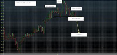
SP500 Point & Fig _ Head & Shoulders Pattern

The Head & Shoulders pattern looks clearer on the Point & Figure chart than on the traditional Candle chart where time makes it appear more unbalanced. Potential target on a daily close below 1045 in this current move, would target 875 using traditional T/A measurement method.

Sunday 6 June 2010

A pivotal week ahead.

The past week or two have been very taxing; as a trader I often tend to give money back at times of market consolidation or ends of trends, last week proved no exception (though thankfully not too much was returned). My trading stance is usually fairly short-term, anywhere from intraday, to a several days or even a couple of weeks, though generally the bias in my trading may last several weeks or even months. My posts over the past 7 days hinted at some sort of pause/correction in the risk sell-off which transpired through May, to be honest I thought there was a possibility that the markets may post a somewhat deeper retrace than they have. This leads me to think that (unless markets post a rapid rebound from last Friday's lows) the downtrend in risk since the end of April is somewhat stronger and more-deep rooted than I had thought, and significant new lows lay in wait.

Looking at FX / Bond Yields / Stocks, I think the coming week could be a make or break week. My own bias is leaning to a break, with the last 2 weeks a failed attempt to hold some crucial supports. I will elaborate with the use of some charts. Firstly the USD index, this is sitting just below the neckline of a major monthly inverse Head and Shoulder pattern. A successful break and hold over the neckline (88.50 v Fridays close of 88.23), could target close to 109 over the next couple of years. - Of course that is not a trade for a short-term trader such as myself, however it is always important as a trader to understand the much bigger picture. - Hence, with regard to the USD, I believe we are at a key inflection point where the USD strength of the past 6 months could evolve into something deeper, and more permanent.

My next chart shows US 10 year Govy yield. This shows a potential 'Double Top' at 4% over the past year. The 'Double Top' low, on a daily closing basis resides at 3.20% (Friday's close was 3.23%), a break below here would suggest a potential target over coming months around 2.34%. Also significant, and probably a final line in the sand would be 3.05%, this line held as resistance during Feb/Mar 2009, and as intraday support late 2009, and the recent May low. - I do qualify this by saying that there is a risk to this forcast, in that a Global Sovereign Debt crisis could send USD yields much higher, although I do think (for now at least) that US govt debt is going to be seen as a safe-haven and potential yield earner.

Should the potential moves to new highs on the USD index and to new lows on the US 10 Year actually transpire, then in my mind this would be indicative of greatly heightened deflation fears. - The effect of deflation would be to lead to further repricing of all assets in USD terms, hence commodities would likely suffer ( including Gold - at least in the short-term), and most if not all currencies would weaken versus the USD, with stocks weakening significantly. - This leads me onto the final chart; the SP500. This S&P is sitting on a critical (and probably final) support line, Friday's price action closed bang on the red support line on the chart below. -- A very interesting and possibly pivotal week lies ahead.


Friday 4 June 2010

Payroll Day & Eurozone Spread Widening.

Today is all about US payroll numbers. its gonna be big,,, but how big.... that is the question..... The reason its gonna be big, as everyone knows is the census worker hiring. The average guesstimate according to Bloomberg is 536,000, however there is a large range from various analysts around this number ranging from the low 200,000s to the mid 700,000s. - I am always amazed that this number is given so much credence by markets, a number that is calculated using so many statistical adjustments, and that is revised so many times over the coming months, so much that its initial release is often meaningless, and yet it probably gets more focus in markets, and more initial trading reaction than just about any other data release on earth.

The markets over the course of this week seemed to have entered a period of calm, relative to action through May. The SP500 had its smallest daily trading range yesterday since late-April. EURUSD continues to gyrate in a spiraling downward fashion within its recent 1.2150-low 1.23s range. USDJPY has been gaining slowly on a less risk adverse environment, perhaps helped by the political situation in Japan, this may have helped calm currencies which reside on the other side of the carry, such as CAD and AUD. So it seems that near-term direction no wmay hinge on a number which is calculated using a somewhat contentious method, which is going to be distorted by a very heavy one-off adjustent, and which will be probably be revised several times over the coming months.

Meanwhile, it is worth a mention that periphery Europe spreads have been widening again over the course of this week. The Spain v Germany 2 yr spread has widened to 225bps and 10 yr spread has widened out to almost 190 bps, that is respective gains of 45 and 37bps over the past week. Other spreads have been widening too; Italy, Portugal, Ireland and Greece have started to rewiden, even France has widened so far this week from 26 - 39 bps, the largest weekly move since 1995. This may well be the early stages of the next phase of the Sovereign Debt crisis, with larger more significant European Countries becoming affected. -- Further to this I have posted a couple of charts below, the first chart is the 2 Year Spanish Gov Bond Yield weekly with 50 week moving average. In Technical Analysis parlance, this may have traced out a 'Rounded Bottom' or 'Frying Pan bottom' pattern, which could portent significant gains in yields in coming weeks. - Below that I have shown how a 'Rounded Bottom' pattern formed on Greek 10 year yields in the latter half of 2009, and how this evolved into the significantly higher yields (somewhat of an understatement) through this year.

Thursday 3 June 2010

EURUSD & SP500 - Interesting Junctures.

The EURUSD may be close to putting in a more significant base (at least for the next few weeks). The chart below is the EURUSD daily since early 2008. The recent price action and momentum set-up on the chart bears a strong similarity to the behaviour at the major price base in Oct/Nov 2008.
A closer look at the two bases (See below) shows an even stronger similarity between the two set-ups. This does not of course mean that subsequent price action will be the same, however it does hint that there is a risk that something similar may unfold. -- With regard to the current price action, this remains in a downtrend for now since the series of lower highs remains in place. However the break over the declining trendline of the descending triangle pattern and rising momentum patterns from oversold, suggest a strong chance that this downtrend may be broken. A break over the recent lowest retracement high @ 1.2356 should confirm the short-term downtrend is over for now.
Elsewhere similar activity across a broad range of markets hints that the episode of risk aversion may be abating. Bond yields are slowly moving higher, USD Libor has flatlined over the past week, front Libor futures have held their recent gains. In FX land USDJPY has rallied, though no doubt helped by the political situation, and AUD and CAD have also made gains. Stock Indices too made strong gains yesterday, though they remain volatile. However it is worth noting that periphery European spreads have bucked this trend by widening further over the past few days and this may still prove to be a thorn in the side of any nascent EURUSD recovery and needs watching.

One more chart which is interesting, which I will post is a comparison of the SP500 over the past year versus the SP500 2006/2007. (See below) - The similarities are stark, though as I mentioned above, caution has to be exercised as similarities can only go on for so long. The implication however, should price action unfold in a similar manor, is for a summer rally back towards the recent highs of April. Personally, as a bear on stock markets and the global economy in general I find this extremely unlikely, yet -- actually I shall say no more....

AlphaMind podcast #107 A US Navy Seal Commander, A Mindfulness Expert, and Self-Compassion

In the brutal world of trading and markets, we can often turn in on ourselves, and end up becoming our biggest problem. The ability to stay ...