Showing posts with label Descending Triangle. Show all posts

Wednesday, 6 February 2013

Is the AUDUSD in the early stages of turning?


One of the questions asked many times over the past couple of years is whether the AUDUSD spot is due to turn down? Many people have put money on the table on this particular trade over the past couple of years, and many have lost that money. However, I sense there are some signs that the AUDUSD may be starting to turn. Below I present a series of charts highlighting my thoughts on this particular currency pair. 

The first chart is the Long-Term chart: – The key feature here is what appears to be a potential reversal‘Descending Triangle’ pattern, bounded by the Blue lines on this chart.  – This pattern is a long-way from any sort of verification, however we may be close to rejecting the attempt at the upper resistance line on this chart, and any clear failure up at these levels may be the precursor for a push towards the low of the pattern in coming months, which sits around the mid-95s. Below the chart is an example of a reversal 'Descending Triangle' pattern.
The second chart is the Weekly chart: – The main feature of this is the extended sideways consolidation of the past 6 months. The past month has seen a rejection of the upper part of this consolidation, and appears to be heading back down towards the low of this range at 101.50. - Within the context of the longer-term chart above, this is not a major move; however any sustained break below 101.50 could be the catalyst for a deeper decline, with the low of the potential 'Descending Triangle' pattern as a possible target.
One of the arguments against the AUDUSD fx rate moving lower is the relatively steady yield gap, which in the current environment would seem to suggest little room for a significant move. The  charts below highlight the recent relationship between the AUD and USD yields over the past few months compared to the AUDUSD spot rate: There has been a close visible correlation between the yield spread and spot FX rate. It would seem based on this that a significant move lower on the AUDUSD would be unlikely.


However, correlations can be misleading; they are only useful as an indicator up to a point, eventually they adjust or break-down. – The next chart below shows the 2 year yield spread versus the AUDUSD spot rate over the past 6 years.  The yield spread has contracted by around 200 basis points over the past two years, with very little change in the general level of the FX rate, perhaps this FX rate could move lower without the general yield spread moving. If this were to happen, this may simply be the FX restoring the prior relationship between the two, or to put it more simple, perhap sthe FX rate will now play catch-up.  
The final chart shows the daily AUDUSD chart. -What is interesting about the move today, is how it has broken the trend of rising reaction lows which has been occurring since early October. This could e a significant ‘Tipping-Point’ if the move is confirmed in the next couple of days .

Finally, there are a number of forces at play in markets at present, with a number of countries actively or encouraging a weakening in the currency. There are no signs at this stage that Australia is part of this movement, however it would be interesting were there to be some move by Australia on this front, particularly with the recent announcements of the Australian election for September this year, and the focus on growth as a priority ahead of restoring the budget back to surplus.

Technical Analysis Note: One of the risks with Technical Analysis is the high degree of subjectivity involved, and the adding of the lines on the Monthly chart is an example which makes the pattern seems apparent. At this stage the pattern in the monthly chart is a long-way from being completed, and could easily dissolve away during the next few weeks and months. Nonetheless from a trading perspective it does highlight possibilities, and long-term investors may see this as offering a good risk/reward possibility.

About the author:

STEVEN GOLDSTEIN is a qualified executive coach and performance coach who works with traders and portfolio managers at some of the world’s leading hedge funds and investment banks. He also provides technical analysis research on a number of major cross currencies for 3CAnalysis. Prior to that Steven had a 25 year career as a trader working at Credit Suisse, Commerzbank and American Express Bank in London in the FX and Fixed Income markets, where he used technical analysis extensively as a trading tool. Steven is also member of the Behavioural Finance Working Group at Cass Business school, has written articles and presented on the subject of Behavioural Finance, and is a lecturer on the Society of Technical Analysts diploma programme. - Please feel free to contact him on sgoldstein@bgtedge.com or visit his website at www.bgtedge.com.

Tuesday, 14 September 2010

USD Weakness, and watch the AUDUSD v SP500 link.

The USD is suffering a fresh bout of weakness this morning pretty much across the board. The chart below shows the USD index, this shows a short-term Head + Shoulders pattern, which suggests further weakness may lay ahead.
EURUSD FX shows a similar pattern, though inverted, and also this has not yet broken through the potential neckline of the pattern (See chart below). I do however have concerns with the above mentioned Head + Shoulder pattern on the USD Index and the inverted pattern on the EURUSD . My concern is that these H+S patterns are not 'End of trend' patterns, ideally Head + Shoulders patterns work best at the end of a significant trend, however the moves prior to these H+S patterns are sharp corrections rather than trending moves. - This does not mean it is invalid, since the essence of the formation exists, however this leads me to question how reliable this particular signal may be.


USDJPY FX

The JPY appears to be the strongest currency this morning, the short-term chart below shows the USDJPY has broken out of a 'Descending Triangle' pattern this morning, if this can be maintained then this could see a move to the low 81s.  Note - the strength of the JPY is something which should be watched, as it would still suggest that 'Flight to Safety' fears remains strong, however over recent days stock markets have certaintly not reflected this. - As an observation, the EURUSD posted a very similar pattern in late May (can be seen on second chart below), this proved to be the 'Last Hurrah' of the large 6 month bearish trend in the EURUSD, of course that does not mean we will have the same here, but it is worth remembering nonetheless, in case this breakdown shows signs of stalling.


AUDUSD FX


The AUDUSD has reached a significant level. Which may have big consequences for the Risk-on/Risk-off trade. The first chart I will show you is a comparison of the AUDUSD v SP500 Index. It shows how over the past year every time the AUDUSD has failed following each approach to the 93.70-94.00 key resistance, at the same time the SP500 has also found key resistance. The initial approach in late 2009 saw the SP500 hit a temporary wall of resistance, it eventually overcame this, however the next approach in January, saw a firm correction in the AUDUSD and a sharp correction in the SP500. The subsequent approach of this key level in the AUDUSD occurred in late April 2010, this was very firmly rejected, and this also was the start of the very sharp correction in the SP500. -- Nearly 6 months later, and the AUDUSD is once again approaching this key level, the SP500 has lagged strongly, however as the AUDUSD moves close to this resistance, the SP500 is also approaching the key resistance which I highlighted yesterday at 1130/32 (Click here to see yesterday's post). - The next chart below shows the AUDUSD weekly chart, this time I am highlighting a pattern which has strong Bullish potential, it is a 'Right-Angled Expanding Triangle'. This pattern is in my opinion amongst the more reliable of patterns, and suggests strong bullish potential on a confirmed break over 94.00/10, however until this occurs the risk of failure/rejection remains high.- If it does make the confirmed break over the 94/94.10 area, then perhaps this could also see the SP500 index make a significant break over 1130/32.


AUDJPY FX

Just a quick update on the AUDJPY cross, this failed to hold yesterday's intraday break (See below). This could be a bearish development for this cross, and could also have implications for stocks, since as previously mentioned, this cross has also been well correlated with equity markets.


Wednesday, 11 August 2010

US 10 Year update.

Following last nights announcement by the FOMC, US 10 Year Yields have dropped to there lowest levels since early 2009 and the depths of the Financial Crisis, closing last night at just 2.75%. This may seem absurdly low to some, whilst others may argue that the Bonds are possibly heading towards bubble status, however my take, looking at the charts, leads me to think that there is still plenty of room for yields to move  lower.

The first chart below is the Weekly US 10 year yield since 2005. This shows a 'Failed Inverted Head and Shoulders' pattern formed over the past few years. The failed 'Head and Shoulders pattern' is probably a much more reliable tool than the actual 'Head and Shoulders pattern'. - The break of the low of the Right Shoulder of the pattern occurred in June and was subsequently re-tested last month, this re-test held well, and yields have since dropped by some 35bps. - Often, this pattern will see the price travel all the way to the peak or base of the head, in this case near 2%. Of course like all patterns it is fallible, however right now it appears to be following the script, and until such time as this does not seem to be happening, then I have no reason to doubt it. 


The next chart shows the US 10 year yield daily chart over the past couple of years. A major Double-Top formed over 2009/2010, this broke down back in June, a target for this is 2.20%. Additionally a strong downtrend channel, which has existed for some months now, is driving ths lower. The recent move up to 3.10% in July, was the re-test of the 'Failed Inverted Head and Shoulders' pattern break line, (as well as being the re-test of the Double-top), and a test of the upper downtrend channel line. - What is interesting here is we have a pattern, within a pattern, the Double-Top pattern sits within the Right Shoulder and the failed breakout of the 'Failed Inverted Head and Shoulders' pattern. - The past few weeks have also seen a small descending triangle, which has broken lower.  - Momentum, daily and weekly, remain supportive in my opinion. - Thus I believe that there are strong arguments, at least technically, for a further drop in US 10 year yields for now.

Tuesday, 22 June 2010

Austerity measures the Vogue in Europe + Japan 10 Year Yield Analysis

Today's main event in the UK, is the new government's first budget, and one that they hope will re-assure markets with regard to the credibility of the UK's finances. However, I think its significance may be that it will be further confirmation of the reversal of the expansionary Fiscal policies of Western governments of recent years, particularly in the wake of the financial crisis and recession of 2007/8. European Governments have started already, in the case of the PIIGS they have been or are being forced into tough austerity measures, whilst the core Euro governments argued strongly at the recent G20 that deficit reduction is now priority Number 1, and Germany just recently announced a budget aimed at drastically reducing its own deficits. Across to the Far-East and just over a week ago the new Japanese prime-minister Kan Naoto spoke of a new 'Third-way' in Japanese economic policy, whereby deficit reduction measures will become a key leg of government policy. Elsewhere, in emerging markets economies, fear of inflation may be leading to stronger anti-inflationary measures, some commentators cite this as one of the reasons for the weekend's Chinese move of allowing its currency to strengthen against the US dollar. - The US continues to stand by its more expansionary fiscal policy of recent years, however the drive for tighter fiscal policies from Europe and Japan, alongside continued deleveraging efforts by consumers, increases the risk that deflationary forces may continue to exert pressure on asset valuations.

I will post one chart today, it follows yesterday's analysis on the US 10 year yield, whereby I stated that I believe the balance of risks favour lower yields, although as usual things are not that straight forward and we remain close to key pivotal levels which could lead to a reversal in yields. Today I am posting a chart showing weekly 10 year Japan government yields over the past decade (See below). Like the US 10 year yield, this sits very close to a major pivotal line, and today it has moved to within a whisker of this level (The close last night was 1.195%, the lowest close since 1.17% in Jan 2009). Also like the US yield chart, significant price patterns are exerting downward pressure on yields, price action over the past couple of years has led to the formation of a Bearish 'Descending Triangle', additionally price action since 2003 has evolved possibly as a multi-year Head & Shoulders type formation. - Since 2003, the support zone of 1.17-1.20 (my line in the sand), has held as support on numerous occasions, and is likely to be a difficult hurdle to overcome, furthermore rating agencies are watching Japan closely which may provide further support. - However, should this line suffer a clear and sustained breach, I believe that it would suggest stronger deflationary pressures ahead for Japan, though this time, it might not be Japan alone facing the threat of deflation.One final set of charts, unrelated to the above. It is the SP index in 3 charts. Top Chart is 1980s through to present day on a Log Scale. Middle chart is SP Index Mar 2009 daily. Lower chart is 5 minutes for past couple of weeks. Are there similar patterns forming across the 3 different time scales?? ,,,or perhaps I am just curve-fitting (Always a danger)? If the S&P bounces to around 1120ish, then falls through support around 1105/06, it may suggest something in this, though the likelihood is strong that I have curve-fitted...........


Thursday, 10 June 2010

Risk on ???

The 'Inverse Cup & Handle' possibility which I mentioned yesterday looks dead in the water, although at one stage last night it did look a good possibility but now its dead... --- Moving swiftly on, this morning it seems that we are moving away from risk-off -- at least for the next few hours/days.... The 'risk-off ' trade of the past several weeks has been characterised by several key features in various asset markets: - Strong declines in major global stock markets, interbank lending rates (Libor) rising, strong USD, JPY and Gold + weak EUR, German and US bonds making strong gains, spreads of Non-German European Bonds widening v German Bond Yields, to name but a few... - However, it appears this morning that a number of these features have turned/ or are turning / or are threatening to turn... Below is somewhat of a chart-fest highlighting these various markets.

Firstly - The USD Index - this has seen very strong gains in recent weeks, however it is running into a major resistance line. - In the bigger picture this is the Neckline of a huge multi-year Inverse Head & Shoulders pattern, in the shorter term however it is major resistance. - Additionally, there is significant divergence between gains in recent weeks and momentum as measured by the RSI and MacD indicator. Taken together this warns of potential reversal or consolidation.
The EURJPY has been watched very closely as this has had a very strong correlation with the move lower on the S&P. At first glance this is showing less sign of reversing than some of the other markets, the downtrend is still strong, however RSI and MacD is diverging from this price action. - In addition Monday's low at 108.08 was an exact Fibonacci 76.4% correction of the entire entire rally from 2000-2008, and was also .06 ticks shy of 1.618x the move from Oct 2009 to the intermediate low in Feb 2010.

Pressure on Interbank lending seems to have eased over the past couple of weeks, the rise in Libor has been minimal or stopped altogether in the past few days, whilst Libor futures which had been moving in synch with equities until late May, has seen strong gains since then. This can be seen in the following chart.
Also note how spreads within Euroland v Germany have started to sharply contract. The following 2 charts show Spain and Italy 10 year yields v German 10 year yields.
Finally equities. First is the IBEX. this has been particularly badly hit in recent weeks. However, there are signs signs that this may (and I re-iterate the word 'may') be turning. The recent low was within a whisker of the 2/3rd retracement of the March 2009 - Jan 2010 rally, momentum is bullishly diverging, and thus far the breakout of the descending triangle pattern is showing signs of a failure, which could see a reversal. Today and by the latest tomorrow, should shed some further light on whether or not this is a failed breakout. - If it is a failure, this should see the Ibex making some decent gains.

The next chart is the AUSUSD v the SP500 since late April. Yesterday I highlighted how the AUDUSD spot seems to have been leading the Sp500, if this is still the case and the AUDUSD manages to hold onto its strong gains of the past 24 hours, then this would favour a strong move higher in the S&P.


In conclusion. The above charts are posted as evidence that the risk-off episode we have been within over recent weeks may be due to correct. I am not going to commit myself to saying this will happen, only there is a lot of evidence piling up against it. I also do not say this as the end of the overall risk-off trade, only that we may see a few days or even a few weeks whereby the market is able to gain some stability. I will also point out some caveats; the moves of the past 24/48 hours could be minor corrective moves which have or will soon have run their course, in addition most markets or risk assets still remain close to recent extremes. Also I would have liked to see the USDJPY perhaps moving a little higher towards the high 91s. Either way I think the markets face a couple of interesting days.

Wednesday, 2 June 2010

EURUSD: Possible bearish set-up - but caution warranted.

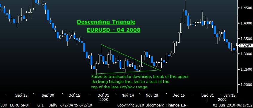
Yesterday saw some extremely whippy price action on the EURUSD. After an initial drop below the base of the recent 1.2145 low, the pair did an abrupt about turn, rallying strongly towards the mid 1.23s (Possibly inspired by Central banks...), before falling back towards the middle of the days range. Yesterday morning I had believed we were on the cusp of a breakdown in the pair, the EURUSD had formed an inverted 'Cup and Handle' pattern, which is a usually reliable continuation pattern. I still believe this may be the case although yesterday's price action has made me more cautious. I have re-designated the current consolidation pattern on the EURUSD as a 'Descending Triangle' pattern (See chart).A note of caution is however warranted. Firstly yesterday may be considered a failed break, the significance of this will be determined by subsequent price action. Secondly there are similarities between the price action recently and the price action during late 2008. The EURUSD had suffered a similar sharp fall during in H2 2008, then through November the pair consolidated in a similar Descending Triangle pattern (See below), which did not follow through as a continuation pattern, but morphed into a larger reversal pattern. One difference, which may be significant, was that the lower Triangle support line in 2008 was slightly upward sloping, which suggested that support was rising, giving this the 2008 triangle a slightly less negative bias.

Time will tell of course (it always does), but for now I am going to sit back and watch. Though I favour the downside, I would rather wait for a confirmed break of support at 1.2150 before jumping in. On the other hand if 1.2350 should break (and hold), the risks may start to be skewed to the upside, and I would have to reconsider.

AlphaMind podcast #107 A US Navy Seal Commander, A Mindfulness Expert, and Self-Compassion

In the brutal world of trading and markets, we can often turn in on ourselves, and end up becoming our biggest problem. The ability to stay ...