Showing posts with label VIX INDEX. Show all posts

Wednesday, 9 May 2012

AUSUSD WEAKNESS and RISK OFF GROWS.

With last week's move continuing this week, the call of the past few weeks for further upside is definitely looking wrong.

Some charts which highlight the turn towards the Risk-Off and some key points. - Followed by interesting price action on the SP500 and VIX.

First however last week's Aussie PMI was very nasty, the chart below shows this and the AUDUSD, and with risk-off gathering pace, including gold breaking a serious trendline(See below) the prospects for the AUDUSD look decidedly gloomy. 

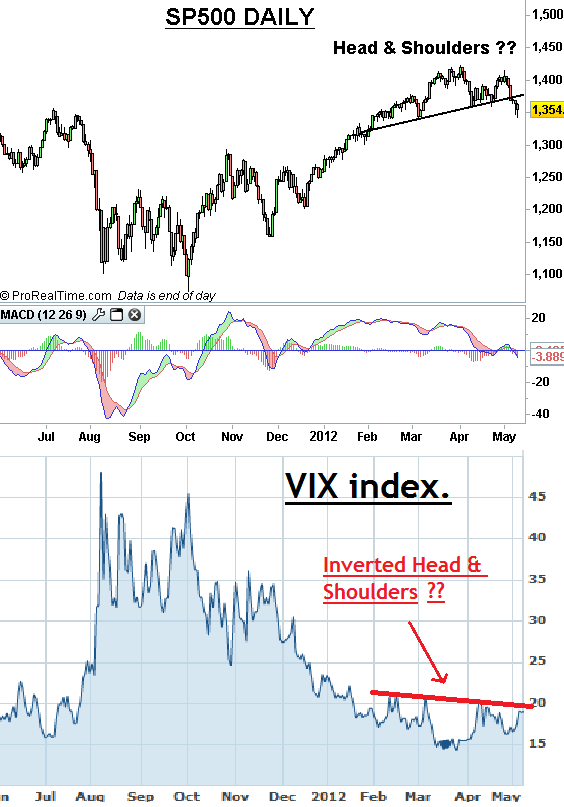
Also interesting action on the Daily SP500: - A 'Head & Shoulders Top' pattern on the SP500 daily, with an inverted Head & Shoulders on the VIX highlighting the risk of a sharp move growing.


Wednesday, 13 October 2010

Equities - the path of least resistance appears to be up.

For now at least the path of least resistance for equities appears to be up. Whatever the reason or rationale, buyers are currently in control, and until this changes, it would be safest to assume there are further highs ahead. The consolidation of recent weeks appears to have finally ended,and it would appear we are now making a thrust away from this, indeed this move appears to be occurring across a number of markets, which adds credence to the idea of further gains ahead. The charts below echo this point, the first set of charts show a selection of US equity indices, the second set of charts show the DAX index and Eurostoxx Index futures this morning.


The next chart shows the VIX index, this appears to have made a break below a large Descending Triangle over the past few months, this drop in volatility below support should be a favourable development for equities.

The last chart is the old laggard, the KBW Bank Index, this still lags the rest of the market, however interestingly it is very close to completing an inverse Head + Shoulders continuation pattern, a clear break up through 48.00 (it closed marginally through here last night) would suggest this may finally start to join the Bullish party. 


Friday, 24 September 2010

SP500 Index, BKX and VIX Update + classic Fawlty Towers.

Yesterday's setback for US equities has not resolved anything, the likelihood of a pullback was strong after the breakout of the neckline of the recent inverted Head + Shoulder formation, however I am still undecided as to whether this is merely a pullback to correct some of the strong rally over the past 3 weeks or if we are looking at something more worrying. I made a decent case for the bullish argument a few weeks back, (This can be seen by clicking here and scrolling down the posting), yesterday I said that there a number of warning signs suggesting caution, that posting can be seen here. - Today I am bringing something new to the argument, it is a further interesting twist on the SP500 it shows the range of the past few months as a very wide consolidation band, sloping slightly upwards. However, whilst at first glance these lines these lines, and particularly the upper line, appear to be drawn against the recent highs and lows, they actually extend a lot further back. - I have pasted a second chart below showing these same lines extended back to 2008.


When looked at from the bigger picture, this turn down from resistance looks like it may have greater significance. The upper line acted as key resistance in June 2009, then as support on several occasions through late 2009 and early 2010. Since late May (the flash crash did break it for a few minutes in early May) it has acted as resistance, with the exception of the failed break above it in early June. - This line has proven to be pretty pivotal over the past year and a half. - The same can be said for the lower line which exactly parallels the upper line. The lower line acted as support in late 2008, despite being broken for a couple of days on a spike basis, it then provided support through Jan 2009, once broken it saw a very sharp decline to the March 2009 low, however when the market recovered it acted as support in April 2009 and again crucially in July 2009. More recently it provided solid support to the two recent lows of June and August this year. - Of course the rejection of the upper line does not mean that it will not break above it, however I think this has throw out a further warning indicator to add to the points I made yesterday.

With regard to yesterday's posting, the Bank Index posted a very poor day yesterday, and closed inside the upper declining wedge line, which further points to an increased risk of a false breakout of this declining wedge. (See chart below).
Finally the VIX index continues to stir, this had failed to decline with the recent rally, it not surprisingly jumped on yesterdays sell-off, and is very close to the upper line of a large declining wedge. A break of this line would be a concern, suggesting possible further gains for the VIX. (See below).

To sum up my view, I do not have a firm opinion at the moment on this, I see an underlying Bullish structure bigger picture, but shorter term I see some indications that are a touch disconcerting. On the downside, I would not take a bearish view yet, I would like to see some sort of cofirmed short-term top, this I do not see yet. I think the market may help me make up my mind in the couple of trading days, in the meantime patience is warranted.

PM UPDATE

The market has made a strong upmove in the wake of this afternoons data, and is currently re-testing the early weeks high, if the market closes anywhere near current levels (1142) this will have completed a Bullish Candle Pattern known as a 'Rising Three Methods' pattern, which is a Bullish Continuation pattern. The insert below shows a typical 'Rising Three Methods' pattern, the chart below shows the current Daily SP500 Future. If the SP500 does hold this level into the close it shifts the odds towards further gains for equities, at least in the short-term.


Finally something for the weekend.

Earlier this week I had a frustrating ordeal talking to a Call centre in India,,, sound familiar?....As the conversation progressed (or rather did not) I could n't help thinking I had the Sub-continent's equivalent of Manuel of Fawlty Towers fame on the other end of the line. Which leads me nicely into this weeks 'something for the weekend', a couple of clips from the brilliant 'Fawlty towers'. The first clip is the Spanish waiter Manuel on the phone. The second clip demonstrates Basil Fawlty unique way of dealing with Communication issues, I would love to know how he would have dealt with an Indian Call Centre.


Thursday, 23 September 2010

SP500 v Bank Index - Some worrying signs.

The last couple of days have seen a pause in the SP500, perhaps this is expected after such a continually strong rally in recent weeks, and given the key break of the 1132 resistance this week, we could be merely seeing a corrective pause. Many of the elements I have mentioned in recent weeks continue to suggest medium term we will see further strength, however I certainly do not consider this a given at this stage, and there is one or two matters which still bother me. One of these is the lagging performance of the Bank Index. - The top chart below shows the Bank Index above and the SP500 below. On the face of it, the Bank Index made a break out of its own Falling Wedge in the past 2 weeks, this should and could be a bullish development, however thus far this breakout has been somewhat uncertain.

Looking at a direct comparison versus the Bank Index and the SP500 the picture however looks more worrying. The top chart below shows the past five years of comparison between the SP500 and the Bank Index. I have highlighted the incidences where the price action diverged negatively between the Bank Index and the SP500, this occurred on three occasions in the early stages of the 2007/2008 bear market and each time subsequently dragged the SP500 lower. The lower chart shows the Bank Index v the SP500 in the past six months, note there is a strong similarity between this chart and the period in the larger chart in 2007 at the start of he major 2007-2008 bear market. 

Another concern has been the recent divergence between the VIX Index and the recent gains on the SP500. The charts below highlight this.

Another worrying sign has been the recent Volume on the SP500; during the rally from the late August lows, the volume has been poor, on Monday it picked up a little, however given the big up day and break of key resistance it was not huge, however the last 2 days have seen small negative days, yet Tuesday was the largest volume day since late June (with the exception of last Friday's option expiry day), and yesterday also saw bigger volume than Monday. (See chart below).


Divergences (either momentum or comparison indices) and volume are secondary indicators, in the same way that a warning light on a car indicator panel warns that there is something which needs looking into but does not necessarily mean the car is about to stall, however, the more indicators are flashing, the more caution should be taken - Currently therefore, I read this as an increased risk of a correction to the recent rally, with an outside possibility of a failed breakout of the recent key resistance around 1126 on the future (1132 Cash), which could have longer-term bearish implications.


Further to the above, I have posted below charts showing the SP500 future (8 hour candles) over recent months, note how the price stalled exactly at the Andrews Pitchfork resistance. The second chart below shows this same chart zoomed in, the futures have broken below the base of the rising channel of the past 2 weeks during the European morning session today, support from the neckline (not shown) connecting the June and August highs come in around 1121 on the future (1127 Cash), a break below here could see a more aggressive correction towards the gap at 1105-09 on the future (1109-1113 Cash).


Thursday, 16 September 2010

US EQUITIES

 Equity indices have reached key levels. The SP500 index is running into 1130/1132 key resistance band, I favour the first shot at this area as likely to see an initial failure, however I have to consider that there is a risk we could see it burst through here leading to heavy stop action, or we could see a small stop induced break and failure.  Bigger picture however, I think there are increasing bullish signs and a successful break over 1132, either now or after an initial setback, will I believe be a signal for further gains in the weeks and months ahead. I do however consider all options open, and can not rule out that a failure here could be the beginning of a sharp decline which could accelerate below 1090. 

My view that we may be heading higher eventually relates to the price action and the pattern formed over recent months. - I posted an article back on the 3rd August (can be seen by clicking here.) where I suggested that the larger formation occurring could be a Falling Wedge pattern which may have a bullish outcome. In support of that I posted the following chart, where I identified different types of Falling Wedge patterns (This is a repeat of earlier exercises I have carried out in Fixed Income markets).

A list of the four types of 'Falling Wedge' can be seen by clicking here. At the time I identified the pattern forming as a 'Type 2 - Falling Wedge', though I did add the following caveat - 'Just to add a layer of confusion (The market does not like to make it too easy). Though I have labeled the recent wedge as a 'Type 2', it is not out the question that it is a 'Type 3' or even part of a larger non-wedge pattern.'  - Price action since then has if anything re-enforced my belief that we have a 'Type 2' pattern, if this turns out to be the case, this would suggest that we should have a bullish resumption, with a strong possibility that we are heading back to the highs of April at a minimum. - By the way though my confidence in the 'Type 2' call is increased, the above caveat still remains. - The chart below show the current pattern labeled as a 'Type 2 Wedge', I have also shown below that the two previous 'Type 2 wedges' from 1998 and 2006.  - Note the 2006 example bears a stronger resemblance to the current pattern.


Further to the above this Type 2 Falling Wedge pattern can be seen across a host of US Equity Indices. The following charts shows the Dow Industrials, Nasdaq and NYSE index.


The Bank Index (See Chart Below), did start to follow its own path on the last low, however it appears that this may have moved back to becoming a 'Type 2' set-up, this is one to be watched...

The Dow Transports Index also shows a similar set-up, however price action created a Type 1 rather than a Type 2 Falling Wedge, this also tends to have a Bullish Resolution (See chart below).


At present none of the above indices have yet made a break above the previous high from early August. This should be watched, since a clear and sustained break over these levels are likely to be the confirmation needed to suggests higher levels ahead, a failure (which I think is most likely short-term) will be lead to further consolidation for now or possibly a deeper decline (which I favour as least likely).

Elsewhere there are other signs which I believe continue to point to an eventual favourable resolution for US equities. The chart below shows the VIX Index v the SP500 index over the past few years, the VIX index continues to trend lower in a similar way to how it moved in early 2009.

Finally a number of key FX markets, which have been strong barometers of Risk-on versus Risk-off over the past few months continue to shows signs of potential bullishness suggesting a return to Risk-on may be on the cards. The top chart below is the EURCHF, the trend remains lower, however there is strong bullish momentum divergence between the low of July and the September lows, as well as within the recent September low. This may be flagging up a risk of a correction higher in the EURCHF cross. The lower chart shows the AUDJPY cross, this has been one of my favoured risk barometers, this has made a decent breakout of the symmetrical triangle, suggesting further gains ahead.


Finally the AUDUSD has a potentially very Bullish 'Big Picture' pattern, this can be seen on the chart below the Pattern is a 'Right Angled Expanding Triangle'. This suggests a strong bullish move eventually for the AUDUSD.  A rising AUDUSD, is something I equate with 'Risk-on'. - However, short-term, it is up against strong and significant resistance, in the same way as the SP500 and other US equity indices. I would be very surprised if the AUDUSD was to make a successful break over this resistance on a first attempt for many months, particularly in light of the 6+ big figure rally over the past three weeks, without any real consolidation or correction.
 

 - To summarise. I feel that the technical outlook for US equity is starting to look brighter, I am seeing what I consider increasing signs of an eventual Bullish resumption for the next several months (though I still feel that this will be a precursor to a much more severe eventual bearish move). In the short-term I still feel a corrective setback may occur, though possibly on a failure at 1132 or on a stop induced breakout above 1132.

AlphaMind podcast #107 A US Navy Seal Commander, A Mindfulness Expert, and Self-Compassion

In the brutal world of trading and markets, we can often turn in on ourselves, and end up becoming our biggest problem. The ability to stay ...